Project type
Web design
Project year
2026
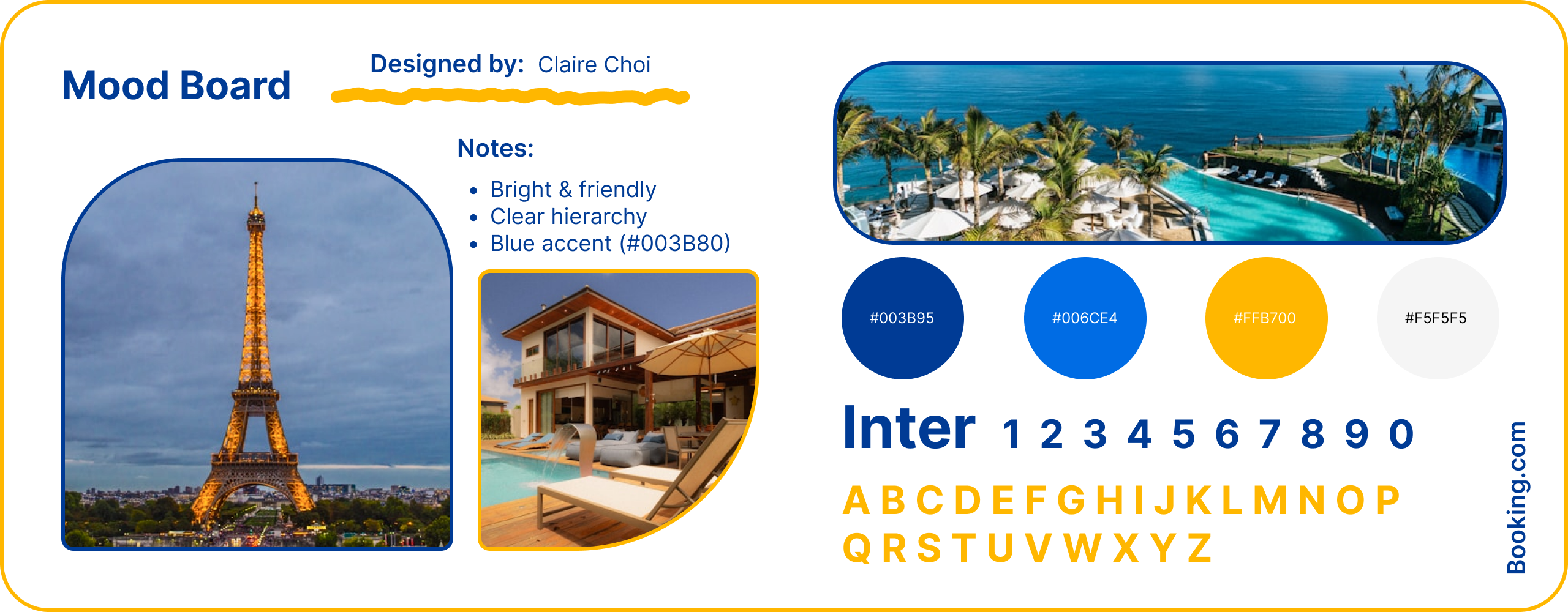
Tools used
Figma

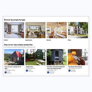
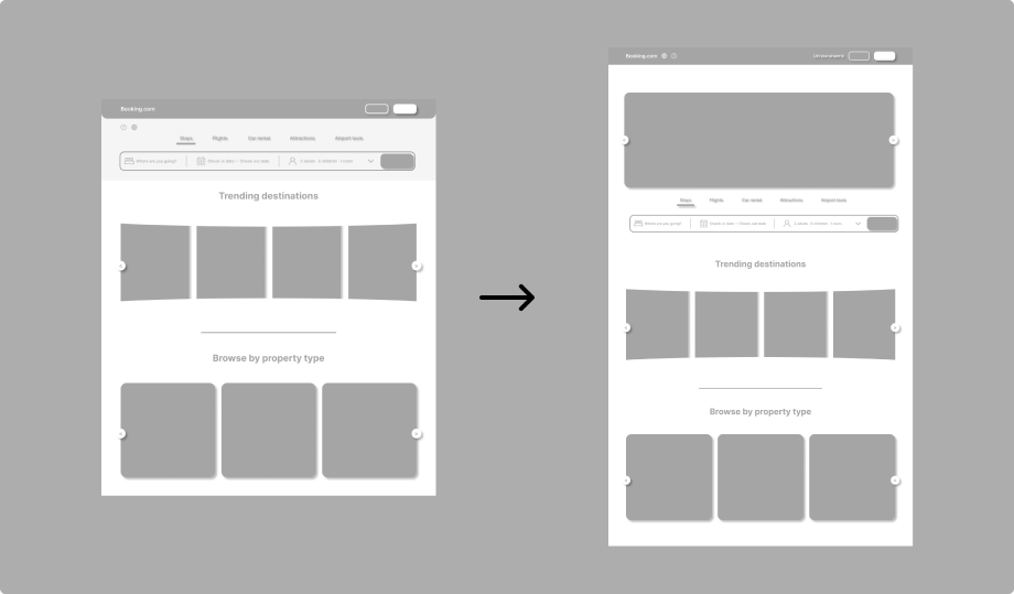
Wireframes focused on the Home and Search Results screens to simplify listing cards and improve scannability. Primary actions and important details were prioritised, while consistent layout patterns and visual grouping supported faster decision-making. Iterative adjustments ensured the design remained user-centred and efficient.
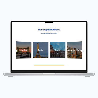
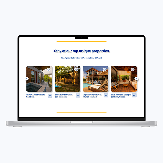
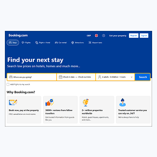
The redesigned Home Page allowed users to scan and compare listings more efficiently by simplifying information structure and clearly grouping key details. Primary tasks, such as searching for and selecting a property, became easier to complete as important actions and information were more immediately discoverable. Reducing visual competition helped users focus on decision-critical content rather than secondary labels or badges. Consistent layout patterns and enhanced visual hierarchy improved predictability and reduced learning effort across different sections. Overall, these improvements lowered cognitive load, increased usability, and created a more intuitive and approachable experience, demonstrating how targeted design changes can effectively support diverse user needs.
This project highlighted how information density and clutter can overwhelm users and slow decision-making, particularly on mobile devices. One of the main challenges was balancing detailed listing information with a clear, scannable layout. To address this, I prioritised key details, reorganised the visual hierarchy, and reduced unnecessary visual noise, ensuring that primary actions were immediately discoverable. This experience strengthened my ability to identify pain points, make user-centred design decisions under constraints, and iteratively test solutions, preparing me to tackle real-world UX challenges effectively.