NHS App

Project type
Mobile design
Project year
2026
Tools used
Figma
Overview
This project focused on making a healthcare app more accessible and user-friendly for people of varied ages, backgrounds, and stress levels. By simplifying the Home screen, prioritising key sections, adding visual cues, and including search and support features, the redesign reduced cognitive load and improved usability while keeping familiar workflows intact.
Original design review
The Home screen presents too many features, which causes cognitive overload and slows down key tasks. The interface is text-heavy with no visual cues, reducing accessibility and making it harder for diverse users to understand information quickly. Additionally, the lack of search functionality slows navigation and increases user frustration, while the absence of an immediate support (PA) button limits user safety and access to urgent guidance.
No items found.
Project goals
  • Design for a broad user spectrum, including varied ages, backgrounds, languages, and high-stress or emergency users.
  • Keep screens simple and focused, using clear visual hierarchy to guide attention and decision-making.
  • Ensure accessibility with clear labels, icons, and visual cues.
  • Improve usability while maintaining familiar workflows and realistic constraints within the government healthcare system.
Mood board

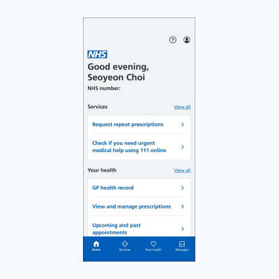
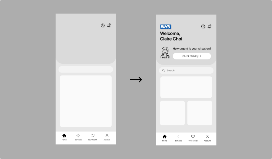
Low-fidelity wireframes were created to explore the Home screen layout, task flow, and content prioritisation. Key actions were positioned prominently, related information was grouped logically, and whitespace was used to reduce cognitive load. Iterative refinement allowed me to balance simplicity, usability, and accessibility for diverse users.

Wireframe (Low-Fidelity)
View all pages ->
No items found.
Final design (High-Fidelity)
View all pages ->
No items found.
Design Transformation
  • Before:
    The Home screen presented too many features and text-heavy content, causing cognitive overload and slowing down key tasks. Users struggled to quickly find important information, and the absence of search and immediate support (PA) options reduced accessibility and user confidence.
  • After:
    The redesigned Home screen prioritised key sections, reduced text, and introduced clear visual hierarchy and icons to guide attention. A search function and PA button were added to improve navigation and provide immediate support in urgent situations.
  • Impact:
    Users can now complete tasks faster and more confidently, with reduced cognitive load and improved comprehension. The redesign preserved familiar workflows while making the app more accessible, intuitive, and user-friendly for a diverse audience.
View all pages ->
No items found.
UX improvement

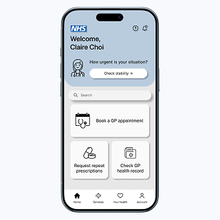
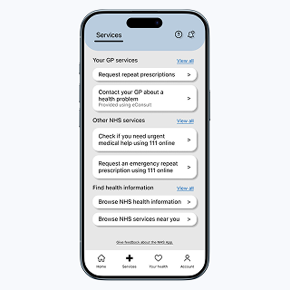
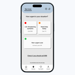
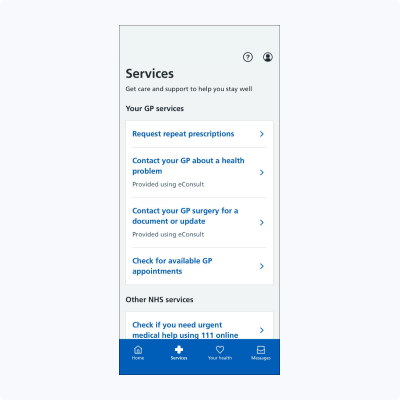
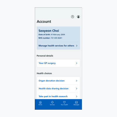
The simplified Home screen significantly improved usability by enabling faster and easier task completion. Prioritizing key sections in the navigation allowed users to access important information more quickly, while a clear visual hierarchy and reduced text lowered cognitive load and improved readability. Icons, visual cues, and a search function enhanced accessibility, helping users understand and interact with content more efficiently. Additionally, the addition of an immediate PA button ensured support was readily available in urgent situations, increasing user confidence and safety. Overall, these changes maintained familiar workflows while delivering a more intuitive and inclusive user experience, showing how targeted design adjustments can create meaningful improvements for a diverse user base.

reflection

This project reinforced the importance of balancing simplicity, accessibility, and usability for a diverse user base. I learned that even small changes in layout, text, and visual cues can significantly reduce cognitive load and improve readability. Preserving familiar workflows was essential to maintain user confidence within a regulated healthcare system, while adding search functionality and an emergency PA button enhanced safety and efficiency. The iterative, user-centred design process allowed me to make decisions based on real user needs, ensuring that improvements were practical and impactful. Overall, this experience strengthened my understanding of how thoughtful interface adjustments can create more inclusive and intuitive digital experiences.