UX Case Study | Web Design
Simplifying how millions find their next stay.
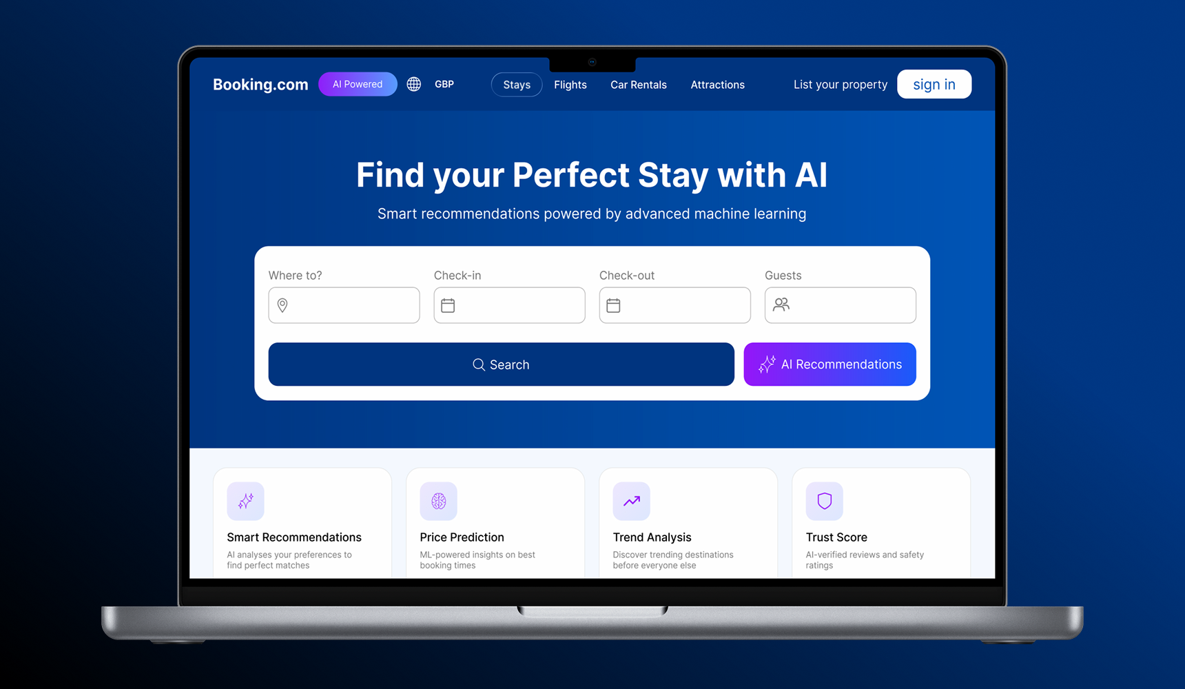
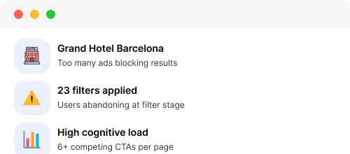
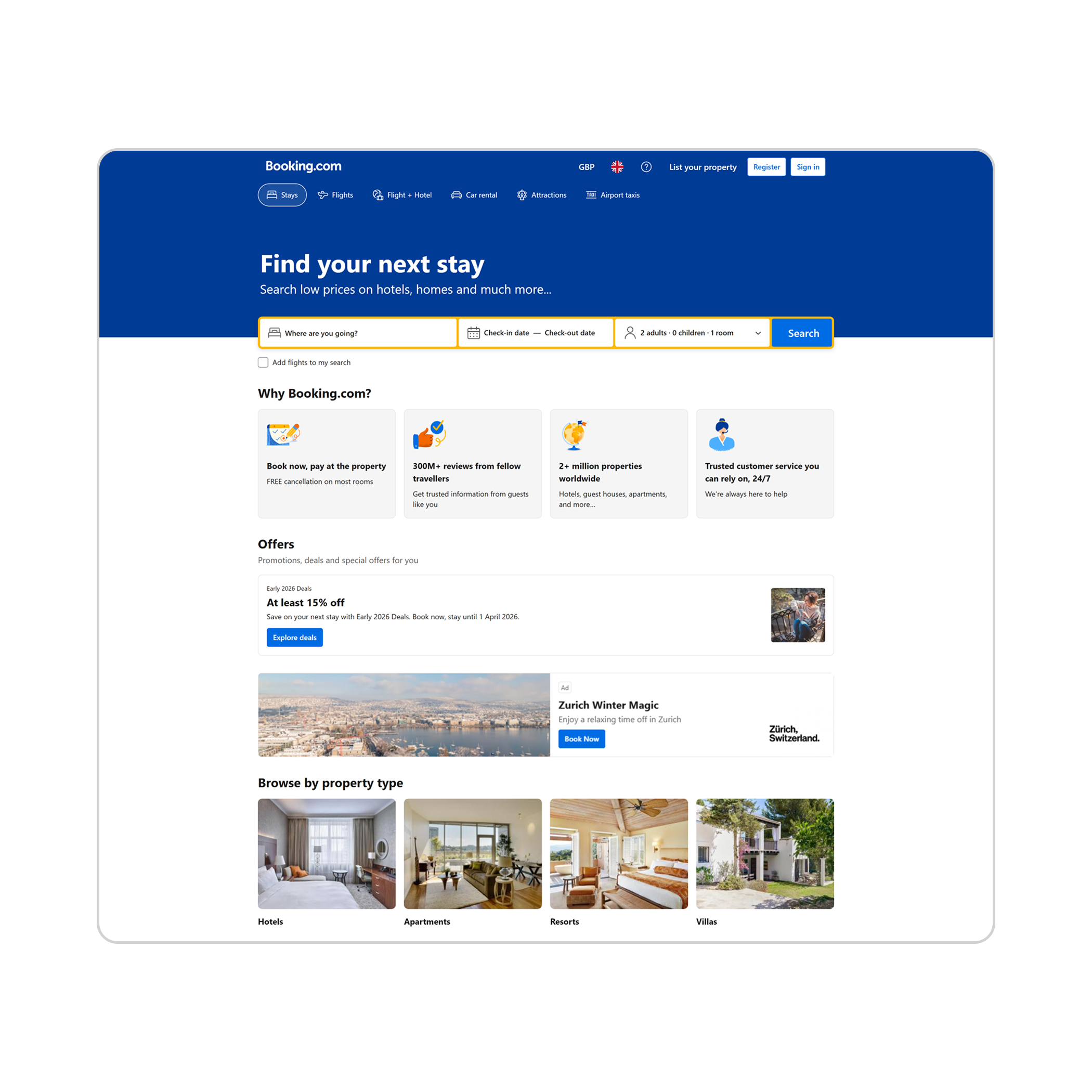
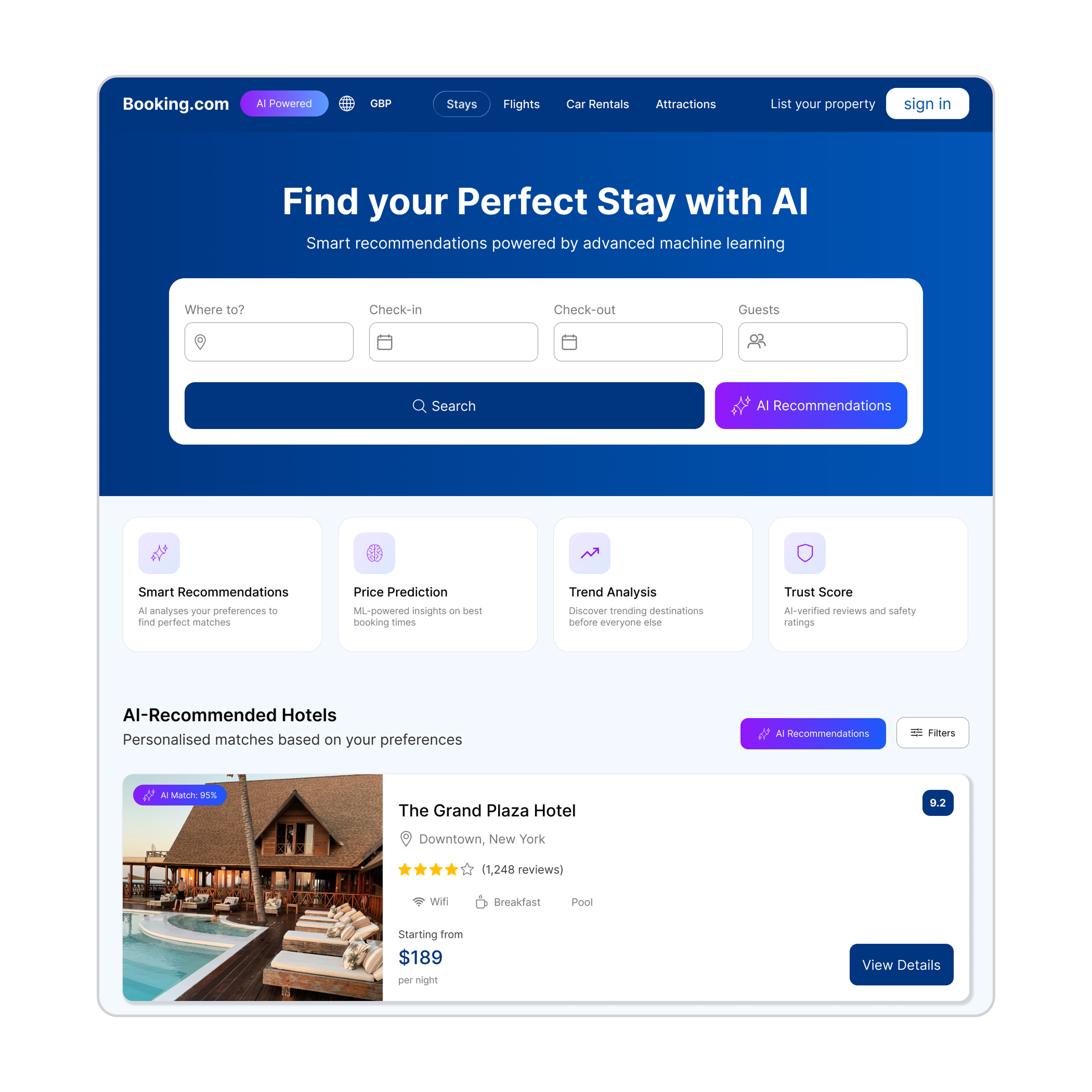
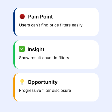
Restructured Booking.com's information architecture to reduce cognitive load — cutting booking time by 35% and improving conversion.
UX/UI Design
IA Restructure
Web · Desktop
Role
Solo UX/UI Designer
Tools
Figma · Webflow
Duration
1-week sprint
Type
Redesign concept